 Amy Judge
Build a Better Website: 6 UX Design Principles To Inform Your Website Design
Building a new website for your business? Or thinking about redesigning your current site? While you’re choosing which theme, colors, photos, and...
Did you know that as much as 90 percent of a person’s initial reaction to your brand could be based on the colors you use in your marketing materials…including your website? 😳
It’s true. One study on color noted that:
“People make up their minds within 90 seconds of their initial interactions with either people or products. About 62‐90 percent of the assessment is based on colors alone. So, prudent use of colors can contribute not only to differentiating products from competitors, but also to influencing moods and feelings — positively or negatively — and therefore, to attitude towards certain products.”
Color isn’t just something that makes your website pretty — it’s a powerful communication tool that can convey your company values and identity at a glance. The colors you choose can drive recognition of your brand, differentiate you from the competition, and even inspire loyalty among your customers.
So how do you choose colors for your website that will communicate the right message to your audience? I’m so glad you asked. 😉
In this blog, we’ll explore the psychology of color for website design — what colors mean, how they affect consumer perception, and how to harness that information to make smart website design choices.

Color psychology looks at the ways color affects human behavior — our perception, emotions, and choices.
We all have a natural, innate reaction to color. For example, warm colors like red, orange, and yellow tend to make us feel energetic, passionate, and happy; whereas cool colors like blue and green elicit a sense of calm and trust.
Understanding how color affects people is crucial when choosing colors for your company’s branding — especially your website. The colors you choose can significantly affect user engagement and conversion rates. When you understand the psychological effect different colors have on people, you can use color as a tool to ensure your website’s aesthetic aligns with your intended message and user experience.
This goes well beyond picking your favorite colors for your website — instead, it’s a strategic choice made by considering how you want your audience to perceive your brand and choosing colors that align with that perception.

I should note that while humans have an innate response to color, there’s also an element of our reaction that is conditioned by personal experiences as well as the society we live in. Colors have different meanings in different cultures. Social and cultural context are important considerations when choosing colors for your website.
For example, in Western cultures, the color white is typically linked with the concepts of simplicity and purity; but in many Eastern cultures it’s associated with death and mourning. Pretty easy to see why cultural context is important, right? This is especially true if your brand is targeting a global audience.
So when choosing colors for your website design, consider the audience you’re trying to reach and how different colors may impact their perception of your brand.

Here’s where we get to the fun part (or, at least, I think it’s fun!) — the meanings associated with each color. Note that I’ve included recommendations for different industries each color works well for. Of course, this doesn’t mean you have to use that color — it’s just that some colors lend themselves better to particular industries over others.
Take a look through these descriptions and see if the meanings of your current website colors align with how you want your brand to be perceived. If not, consider which colors might better suit your business.
Note: depending on your audience, the meaning of a color may vary from what we've described here.
 Red
RedRed is stimulating, prompts action and urgency, and symbolizes passion. It’s associated with power, energy, importance, aggression, love, and drama. Red elicits a strong emotional reaction, and can be overstimulating if it’s used too much.
Recommended for: fashion, makeup, food, entertainment, sports, marketing, emergency services, retail, automotive, hardware, “sale” signs
Brand examples: Coca-Cola, Netflix, H&M
.png?width=142&height=142&name=Untitled%20design%20(1).png) Orange
OrangeOrange imbues a sense of friendliness, sunshine, playfulness, confidence, individuality, youthfulness, excitement, warmth, and creativity. It’s also associated with both haste and caution. It symbolizes movement and can be calmly energetic.
Recommended for: beverages, retail, fitness, technology, entertainment, food, childcare
Brand examples: HubSpot, Dunkin’ Donuts, The Home Depot
.png?width=142&height=142&name=Untitled%20design%20(2).png) Yellow
YellowYellow promotes enthusiasm, imbues comfort and invigoration, heightens emotions, and is associated with playfulness, happiness, fun, cheerfulness, and optimism. It’s also sometimes used for warning signs. Used in small doses, it can build excitement; but too much yellow can be overwhelming, causing eye fatigue and even anxiety.
Recommended for: automotive, retail, food, technology, construction
Brand examples: Amazon, SnapChat, McDonald’s
.png?width=142&height=142&name=Untitled%20design%20(3).png) Green
GreenGreen symbolizes balance and stability, fresh energy, and growth. It’s associated with nature, creativity, wellbeing, innovation, money, affluence, and success. Green is so tied to eco friendliness that the color alone can imply that a company is ethical. The easiest color on the eyes, green connects the warmth of yellow and the cooling properties of blue.
Recommended for: Medicine, science, government, recruitment, ecological businesses, tourism, human resources, finance
Brand examples: Starbucks, Spotify, Fidelity Investments
-2.png?width=142&height=142&name=Untitled%20design%20(4)-2.png) Blue
BlueBlue symbolizes trustworthiness, promotes relaxation and calmness, and is associated with serenity, intelligence, reliability, and sincerity. Extremely versatile, blue is the most-used color in web design. That said, too much blue can make a design feel cold, and since it can suppress the appetite, it’s not a great option for food websites.
Recommended for: Medical, dental, science, utilities, government, healthcare, corporate, recruitment, legal, information technology
Brand examples: Facebook, Procter & Gamble, GE
-3.png?width=142&height=142&name=Untitled%20design%20(5)-3.png) Purple
PurplePurple symbolizes luxury, has historic ties to royalty, and is associated with elegance, mystery, imagination, wisdom, spirituality, sensuality, and creativity. It combines the power of red with the stability of blue.
Recommended for: beauty products, massage, yoga, healing, spirituality, astrology, feminine brands
Brand examples: Curves, Claire’s, Cadbury
-3.png?width=142&height=142&name=Untitled%20design%20(6)-3.png) Pink
PinkPink is associated with sweets, candy, babies, sincerity, romance, sophistication, and love. It’s often used to symbolize femininity and softness. Pink can be soft and sweet in lighter shades or strong in darker ones. Use this color in moderation, as too much can be overwhelming to the eye. (Unless, of course, you’re going for an all-out Barbie-pink sort of aesthetic, then go wild…just make sure to balance it out with light, airy colors.)
Recommended for: Pediatrics, OB/GYN, sweet treats, cosmetics, retail
Brand examples: Cosmopolitan, Barbie, T-Mobile
.png?width=142&height=142&name=Untitled%20design%20(7).png) Brown
BrownBrown is associated with dependability, humility, ruggedness, earthiness, and the outdoors. In food advertising, it can stimulate the appetite (think chocolate and coffee). On its own, it can be dull, but paired with other colors, it can help highlight them. Brown is the least popular color for web design, as it’s difficult to keep it from looking bland.
Recommended for: food, veterinary, finance
Brand examples: UPS, M&Ms, Hershey
.png?width=142&height=142&name=Untitled%20design%20(10).png) White
WhiteWhite promotes a sense of calm and freedom, and is associated with purity, simplicity, virtue, and sterility. However, it can also be seen as cold, stark, or aloof. An off-white shade like ivory or cream can minimize these negative aspects and provide a warmer tone. White is best used as an accent color and creates visual breathing room on the page.
Recommended for: healthcare, technology, science
Brand examples: Apple, Uber, Nike
.png?width=142&height=142&name=Untitled%20design%20(8).png) Black
BlackBlack is sophisticated, timeless, and classic, and is associated with luxury, elegance, power, and exclusivity, as well as mystery, rebellion, and edginess. Too much black can be overly dominating, but used sparingly, it can be grounding. Black pairs well with white and bright accent colors.
Recommended for: finance, fashion, cosmetics, luxury goods, marketing
Brand examples: Chanel, Louis Vuitton, Gucci
.png?width=142&height=142&name=Untitled%20design%20(9).png) Gray
GrayGray is associated with timelessness, sophistication, formality, professionalism, practicality, neutrality, balance, and strong character. It can have a balancing effect, simultaneously presenting both strength and calm. Be careful though — too much gray can come off gloomy.
Recommended for: automotive, journalism, sportswear, technology
Brand examples: Audi, Mercedes-Benz, Apple

Now that you understand a bit about the psychology of color for website design, it’s time to choose your own color scheme!
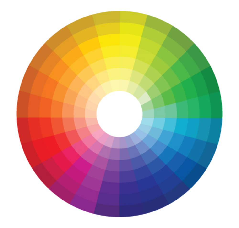
Choosing a color scheme doesn’t have to be complicated. A “color scheme” simply means colors that go well together. The most basic color schemes involve complementary colors (those opposite one another on the color wheel), analogous colors (those next to each other on the color wheel), or a monochromatic scheme (different hues of a single color).
Your website should have at least three colors: a background color, a base color, and an accent color. As you might guess, your background color will create a backdrop for the other colors, your base color will be the main color you’ll use, and your accent color will complement those colors. You can choose more than three colors, but don’t go overboard — in most cases you’ll want to stick with 3-5.
To choose your colors, consider:
In addition, you may want to do some A/B split testing and collect user feedback to test different color options in various contexts (different devices, lighting conditions, etc). This will give you a better idea of what resonates with your audience so you can refine your colors from there.
We recently updated our own color scheme for our website and logo, and we LOVE how it reflects our fun, friendly, and creative team!

Once you’ve landed on a color scheme, it’s time to apply it across all elements of your brand: your website, of course, but also your logo, social media graphics, packaging, and other marketing materials. Consistency with your color scheme will help encourage brand recognition.
So…what colors will you pick for your next website update?
Speaking of website updates, did you know the Wild Fig team can help design and build your website? In fact, we’ve helped many clients create beautiful websites that reflect who they are, what they do, and how they improve their customers’ lives.
From writing your website copy to designing the layout and helping you choose a color scheme, the Figgy team can help you build a website you’ll love.
If you’re feeling inspired by all this talk about color psychology and want help designing a fresh new website for your business, we’d love to connect! Schedule a complimentary exploratory call to discuss your needs and how we can help.


Building a new website for your business? Or thinking about redesigning your current site? While you’re choosing which theme, colors, photos, and...
![How Often Should I Refresh the Content on My Website? [And Why Is It Important?]](https://www.wildfigmarketing.com/hubfs/bigstock-Technical-Support-Programming-460826949.jpg)
If it's been a while since you made updates to your website...it might be time.
Have you been thinking about building a website for your business?