

 Amy Judge
How To Apply the Psychology of Color to Your Website Design
Did you know that as much as 90 percent of a person’s initial reaction to your brand could be based on the colors you use in your marketing...
Building a new website for your business? Or thinking about redesigning your current site? While you’re choosing which theme, colors, photos, and information to include, don’t forget to keep a crucial aspect of great website design in mind: user experience (UX).
UX is what makes a website easy to navigate and enjoyable to use. Considering your website visitors’ experience helps you create a more meaningful and engaging site — one that draws people in and turns them into customers.
After all, the ultimate goal of website design isn’t just to give you a pretty website or an ego boost: it’s to make your business attractive and accessible to your audience.
Read on to learn more about what UX entails plus six UX design principles to consider as you build your new website.

Website design isn’t just about what your site looks like: it’s about how your site functions. That’s where UX design comes in.
UX describes how engaging and satisfying it is for a user to interact with your website. It covers a wide range of elements, including ease of use, functionality, efficiency, and visual and emotional appeal. The goal of UX design is to optimize these elements by understanding your users’ needs and preferences and creating memorable experiences that meet those needs and preferences.
Why does this matter?
Because the experience users have on your website directly affects their engagement, satisfaction, and the likelihood they’ll do business with you. UX website design principles can help you improve user engagement, elicit brand loyalty, and drive conversions.
This should go without saying, but considering the number of websites out there that are clearly NOT designed with the user in mind, here we are. When you build a website for your business, your focus should be not on your own personal preferences, but on the needs of your ideal consumer.
To get there, you first have to get to know your users and their needs, goals, and pain points so you can address them in your site design. Think through the ways your users will actually interact with your site and the tasks they’ll most commonly use it for, and keep those factors at the forefront of your mind throughout the design process.
In addition, there are two main design aspects to consider when building a user-focused website: usability and accessibility.

Website users should be able to quickly and easily find what they’re looking for and complete any actions (purchasing an item, filling out a contact form, etc) accurately and effectively. To create a site with good usability:
This is just a brief list, but it gives you an idea of what creating a website with high usability entails.
Designing your website for accessibility means ensuring that all users can understand, navigate, and interact with your site — regardless of their physical, visual, auditory, or cognitive abilities. Within website design, this can include:
For more ways to make your website accessible, consult the international web content accessibility guidelines.
Usability and accessibility design considerations will help you provide a seamless user experience for everyone — and reach a broader audience for your business.

If your website looks and functions great on a computer, but not so great on a mobile device, you’re missing a huge swath of your audience (likely more than half).
Responsive web design is vital to building an effective website.
Websites that are mobile responsive are optimized for different devices and screen sizes so the layout, content, and functionality automatically adjust for better usability and readability. In addition, there are a few design choices you can make to help make your website easy to navigate on multiple devices:

When it comes to calls to action (CTAs), less is more. If you have several different CTAs on one page, it can feel disorganized and overwhelm your users. You need to narrow down the options to make your users’ experience seamless.
In the example above, the homepage of a website we designed for The Survival University, you can see that the primary CTA is “Choose a Course.” While there were a number of calls to action this client could have included on their homepage, they narrowed their focus to guide people to browse their course catalog and sign up for a course.
Bonus: focusing on a single CTA is better for sales as well — it allows you to lead your users down a clearly defined path to conversion.
While we’re talking about CTAs, here’s another tip: stay away from generic “learn more” or “get started” CTAs as much as possible.
Get specific — and creative — with your calls to action, directing users to click the button to complete a specific task or receive a specific benefit. For example, “Sign Up Here” is a little vague, and frankly not that exciting. But “Sign Up for VIP Access” is both specific and wayyy more enticing. Which would you be more likely to click on?
So, in summary: pick a single primary CTA for each page of your website, and get creative and specific with the wording you choose.
Learn more about writing great CTAs in this blog!

Good website design guides users through a page using a content structure with a clear hierarchy of importance. Arranging your website content into a hierarchy will help guide users toward the most important or relevant content, reducing friction points while also allowing users to explore the site as they wish.
To create a content hierarchy, you first need to determine your focal point — the most important element or message you’re trying to get across on the page. Think about the primary goal or task users typically want to accomplish on your site (remember: focus on the user, not yourself!) — that should be your focal point.
Then, establish a visual hierarchy to make sure any relevant content that supports those goals is prominently displayed. There are a couple of design tools you can use to ensure key information stands out on your website and is easy for users to scan:

Another way to ensure good user experience on your website is to use consistent branding and design throughout your site.
All too often in our work, we come across websites where the branding and design are all over the place, with very little consistency throughout the site. This can make a website feel cluttered, disorganized, and, frankly, unprofessional.
It’s important to maintain a uniform experience across your site. This means keeping all visual elements — including layout, colors, typography, and imagery — consistent.
Listen: we know how exciting it can be to design your website and how tempting it is to use every design element that catches your eye. But trust us, it’s more effective to narrow down your choices and stay consistent throughout your site.
When the elements of your site follow a consistent design pattern, users will be able to quickly find and access the information they’re looking for.

For a great example of design consistency, take a look at this website we created for Kaas Wilson Architects. As you browse through the pages of their site, you’ll see a consistent design theme, color palette, and branding throughout.

The visual elements of your website are a key part of building a good user experience. If your site is just a bunch of text, users will quickly lose interest and leave. Imagery catches the eye and, when used well, can communicate concepts more quickly and efficiently than words. (“A picture is worth a thousand words” is a well-known saying for a reason — it’s true!)
That said, poor quality photos will only hinder your message. Popping unedited smartphone pics onto your site may save you the cost of hiring a photographer…but they can bring the quality of even the most beautifully-designed website down a notch (or ten).
Photos are NOT the place to skimp. Set aside some of your website design budget to hire a professional photographer to take high quality photos of your team, your building, and your products. You can supplement with a few stock photos, if you like (but keep in mind that using too many stock photos can make your website feel impersonal).
Remember: your website is your online storefront. Making a good first impression online is just as important as it is in person!
A great example of the power of high quality photos can be seen on this website we created for ErgoWorks. In this case, you can see how quality photos showing satisfied clients really helps show potential customers how they’ll feel when they work with ErgoWorks.

It doesn’t take a lot of photos to make a good impression. If you browse through this website, you’ll see that even a few great photos per page really makes all the difference.
Whether you’re building a new site or planning a redesign, we hope this list helps you create a website that draws in your audience and boosts your sales! Even implementing just one of these principles will lead you on the path to building a better website for your business.
Want help designing your next website? Schedule an exploratory call to discuss your website project and learn how the Wild Fig team can help!


Did you know that as much as 90 percent of a person’s initial reaction to your brand could be based on the colors you use in your marketing...
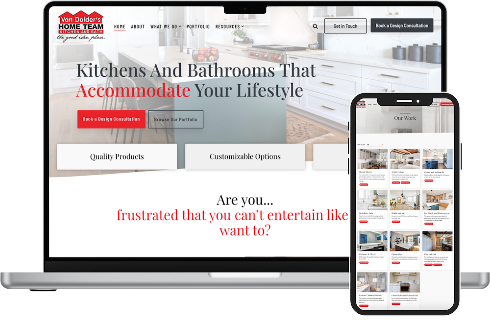
When our client, Van Dolder's Kitchen and Bath, came to us, they didn't like the look, feel, and functionality of their existing WordPress website...
Part 3 of a 3-part series on SEO basics